Jeff's Chicken Shack
Useless Blog
In the spring of 2000, I was shown a new internet fad called "blogging." With the help of 5 free megabytes at Angelfire and one of the relative first handful of Blogger accounts I created "Jeff's Chicken Shack." A few months later I purchased jeffschickenshack.com (I do not link to it because it is no longer my site and is now a porn site - more on that later).
Initially, I knew nothing about designing an entire site from the ground up. So I threw together some tables, changed some text colors, and made a couple ill-conceived graphics. The results were pretty bad, and I knew it was bad, but I had no idea how to do it any better.
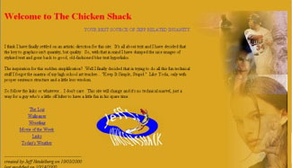
The first attempt at building a web site. I would like to think I have come a long way from these humble beginnings.
The Rise of CSS
In early 2001, I discovered the magic of Cascading Style Sheets while viewing source code on pages with fixed background ../images. CSS allowed me much more freedom of design and turned the Chicken Shack into my web design sandbox. Version 2.0 of the Chicken Shack, which would stick around until June of 2002, had a navigation bar and a fixed graphic image to frame the content.
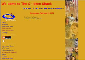
This was the stable and most recognized version of Jeff's Chicken Shack. This design was in place from early 2001 until June 2002.

I used Paint Shop Pro to make the photo collage that created the right border of Jeff's Chicken Shack. The ../images were somewhat randomly selected from ones I happened to have on my computer at the time.
New Direction
In April of 2002, the Chicken Shack was getting stale. Updates were slow and infrequent and the number of visitors was starting to decrease. At the same time, I started to get e-mails about placing my desktop wallpapers on other sites. I started to think that the Chicken Shack should evolve as I had over the past year. I needed to display my graphic design abilities more prominently on my site.

This version was never released publically, but it is by far my favorite version of the site. The collage was definately my best ever, but ultimately I made a mistake and moved away from the "brand" I had created.
Though the results were amazing visually, I scrapped the redesign because the image files were simply too large to work on a web site. I also wanted to move farther away from the whimsical nature of my site.

This is a 1:1 graphic of the header. The ../images look amazing and I love the way I put them together, but with visual beauty comes unbearably large file sizes.
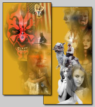
This is the right border that accompanied the header shown previously. Darth Maul's head was positioned to line up on both the header and the border to create a frame for the content. Using layouts where pixel-perfect positioning is required is not generally recommended. But it usually looks really cool.
Final Design
After a couple months off, I gave the Shack one more burst of my energy. I had become more serious and felt the fun-loving tone of Jeff's Chicken Shack was not inline with how I wanted people to see me. The result was the third and final version of jeffschickenshack.com, the design that was in place when it closed its doors at the end of July 2002.
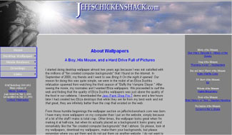
This is what the Shack looked like after the move to a more professional feel. This is also what it looked like as it went offline.
Epilogue
My two year lease on the jeffschickenshack.com domain expired in July of 2002. I didn't really update the site much and at the time I really had no direction in mind for it. So I did not renew the name and a web entreprenuer in Las Vegas, NV snatched it up. For a few months it was just a generic "waiting to be developed" page then it was sold to a company in Amsterdam and turned into a porn site. In hindsight I didn't realize that through the fun-filled spirit it was created in and the experimental way I used the space, Jeff's Chicken Shack had become a brand of sorts. It was so odd and because of that people remembered it and the name on its own communicated what I wanted it to. Maybe one day I will buy it back... but for now it is simply My First WebsiteTM.